 Norbert Brett
Accessibility is not a generic widget toolbar bolted onto the corner of the screen; it is whether your custom UI works when the mouse is unplugged.
Why Custom Design and Accessibility Belong Together
If you have ever pressed the Tab key on a flashy agency website and watched your cursor disappear into an invisible menu while the background page keeps scrolling, you have seen what happens when visual style is built without accessibility. Months earlier, while auditing a client's Vue web application built in 2025, I was annoyed to find twelve clickable service cards built out of generic <div> boxes instead of real <button> elements—meaning anyone using a keyboard or screen reader could not open a single card, and light-gray text on a white background sat at a barely legible 2.4:1 contrast ratio.
In Plain English — What Does "Web Accessibility" (
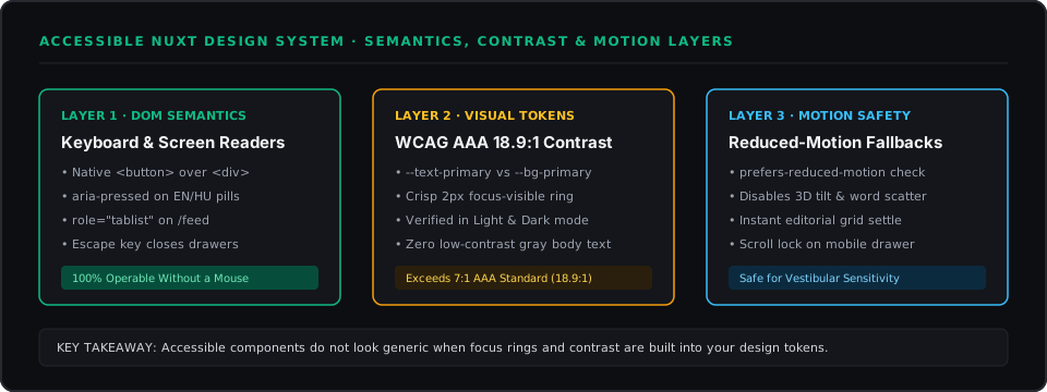
a11y) Actually Mean? Accessibility means building your website so everyone can use it—including people with visual impairments using screen-reader software, customers with temporary wrist injuries navigating by keyboard (Tab,Enter,Escape), users reading your site in bright outdoor sunlight, and people sensitive to rapid screen motion.
- Semantic HTML: Using the real building blocks the browser understands (
<button>,<nav>,<main>) instead of generic boxes (<div>) so assistive tools automatically know what is clickable.- ARIA Attributes (
aria-pressed,aria-expanded): Short status labels attached to HTML buttons that tell a blind or low-vision user's screen reader "Language toggle: English, currently pressed" or "FAQ item: collapsed."- WCAG Contrast Ratio: A standard scale from
1:1(invisible) to21:1(pure black on pure white) measuring how easy text is to read. Standard compliance (AA) requires4.5:1; gold-standard compliance (AAA) requires7:1+. Our primary buttons hit18.9:1.
When Native HTML Is Enough—and When to Use a Component Primitive
You see, many business owners worry that making a site accessible will force it to look like a generic government form. The opposite is true when you separate behavior from visual styling:
- Controls where native HTML + ARIA labels do 100% of the job:
- Bilingual & Currency Toggles (
EN / HUandHUF / EURinPricingCalculatorSection.vue): We use real<button type="button">elements grouped insiderole="group"with:aria-pressed="lang === 'en'". - Category Filter Pills (on
/feed): Wrapped inrole="tablist"withrole="tab"and:aria-selectedon each pill so keyboard users can switch categories effortlessly. - Expandable Process & FAQ Rows: Wired with
:aria-expanded="isOpen"so screen readers announce whether details are open or closed.
- Bilingual & Currency Toggles (
- Complex menus where a "Headless Primitive" (
Reka UI/Radix Vue) saves weeks of bugs:- What is a Headless Component Primitive? It is an unstyled code building block that handles all the tricky keyboard arrow-key math, focus trapping, and
Escape-key closing for complex popups, while letting you apply 100% of your own custom fonts, colors, and borders.
- What is a Headless Component Primitive? It is an unstyled code building block that handles all the tricky keyboard arrow-key math, focus trapping, and
<!-- From PricingCalculatorSection.vue: Custom Swiss pill with full keyboard & screen-reader state -->
<div
  class="inline-flex items-center rounded-full border border-[var(--border-strong)] bg-[var(--bg-elevated)] p-1"
  role="group"
  aria-label="Language toggle"
>
  <button
    type="button"
    :aria-pressed="lang === 'en'"
    class="px-3.5 py-1.5 rounded-full font-mono text-xs font-bold uppercase tracking-wider transition-all focus-visible:outline focus-visible:outline-2 focus-visible:outline-offset-2 focus-visible:outline-ink"
    :class="lang === 'en' ? 'bg-[var(--text-primary)] text-[var(--bg-primary)]' : 'text-[var(--text-secondary)]'"
    @click="lang = 'en'"
  >
    EN
  </button>
</div>
Designing Focus Rings, Contrast, and Motion That Respect the User
Some designers disable keyboard focus outlines (outline: none) because the default browser blue ring clashes with their color palette. That leaves keyboard users completely blind to where they are on the page. Instead of hiding the ring, we styled focus-visible:outline-2 focus-visible:outline-offset-2 focus-visible:outline-ink—which draws a sharp, architectural 2px border matching our Swiss grid only when someone navigates with a keyboard, never when clicking with a mouse.
Three final engineering habits keep visual polish and accessibility working together across this site:
- 18.9:1 WCAG AAA Contrast in Both Light and Dark Modes: Every surface color token (
--bg-primary,--text-primary,--text-secondary) was tested across both themes so text stays effortless to read indoors and outdoors. EscapeKey & Scroll Restoration on Mobile Menus: InAppNavbar.vue, opening the mobile drawer locks background scrolling and listens for theEscapekey (if (e.key === 'Escape' && isMobileMenuOpen.value) closeMobileMenu()), so no user ever gets trapped inside an open menu.- Respecting
prefers-reduced-motion: reduce: Both our scroll-driven typography and the 3D card hover tilt inArtworkCanvas.vuecheck the user's operating system motion setting first. I felt relieved when testing the site with macOS Reduce Motion turned on: every animation stepped aside cleanly and presented the finished layout with zero visual jarring.
Working on something similar?
Tell me about it